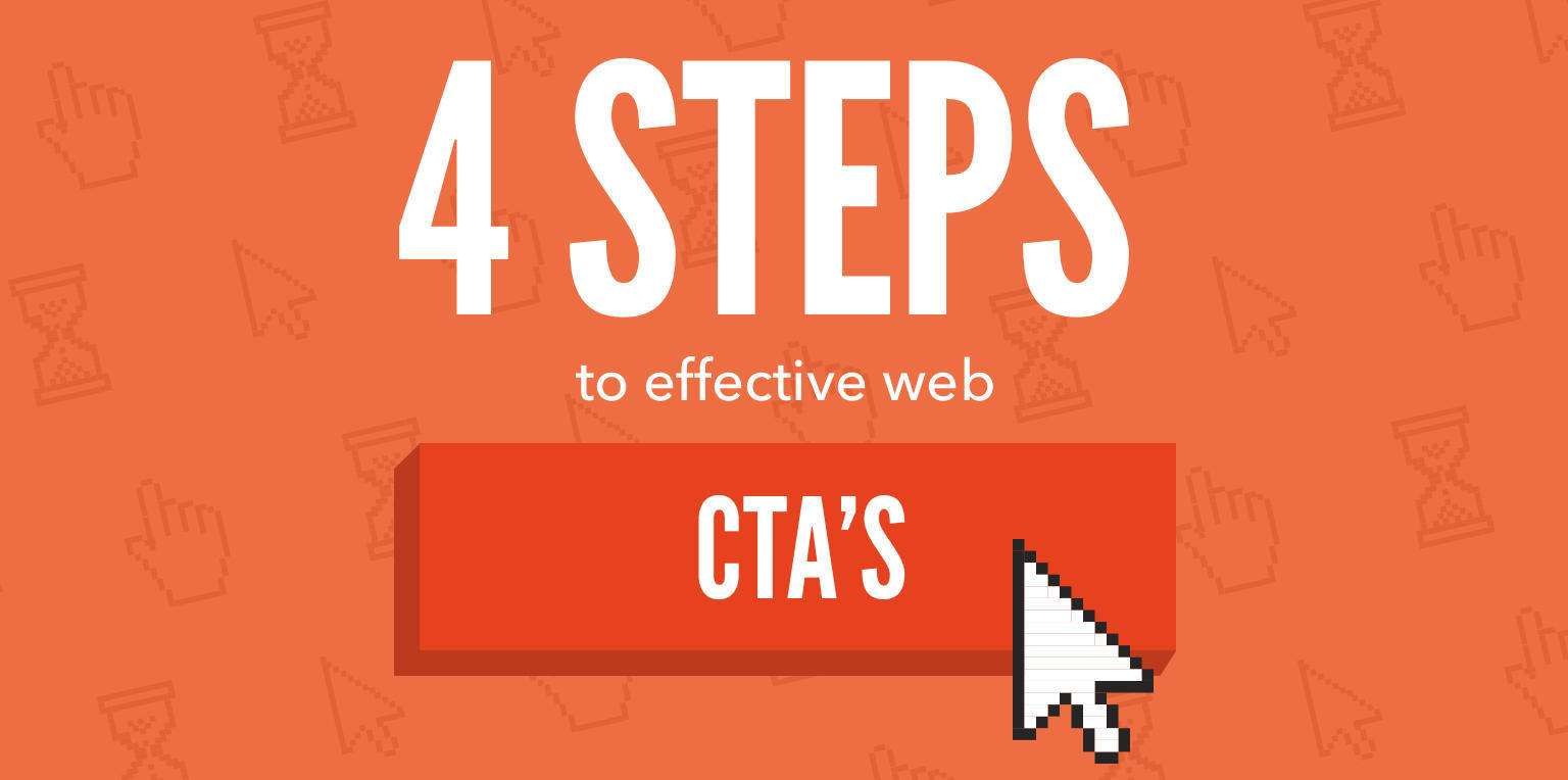
4 Simple Steps to Effective Web Design CTAs
Four steps that you can take to create compelling web design CTAs that resonate with your audience, encourage clicks and grow your business.
Posted: Jun 1, 2017
Last Updated: Jun 1, 2017
Business owners and marketing managers alike know how important it is to convince your website visitor to click that “special link.” Whether you’re asking them to buy, try, or subscribe, this all too important link is known as the call-to-action (CTA). Web design CTAs are typically displayed as buttons or text links. You probably have CTAs throughout your website, but are you really convincing your users to click?
Let’s talk about four important steps that you can take to create compelling website calls-to-action that resonate with your audience, encourage them to click, and ultimately result in business growth.
1. Know whether to pop the question or ask for a date
It sounds weird but hang with us. Asking someone out on a date is fairly easy and worry-free compared to asking for someone’s hand in marriage. As Donald Miller taught us, you should think about various customers and CTAs in this way. Depending on where your customer is on your website and in the sales funnel, you will either need to ask them to “go on a date” or to “marry you.”
In more official terms, “marriage” is a primary call-to-action and a “date” is a secondary call-to-action. Primary calls to action include things like “buy now,” “schedule an appointment” and “donate.” The user is comfortable enough with you to take the plunge. Secondary CTAs exist to help your customer go deeper with your brand. They are introductory steps to take before a customer is ready for the primary CTA. Examples of secondary calls-to-action are “watch the video,” “download the white paper” and “stay in touch.” Secondary CTAs are especially important if you have an expensive product or a long sales cycle. Ask your customers on enough “dates” so they’ll soon be ready to “marry you.”
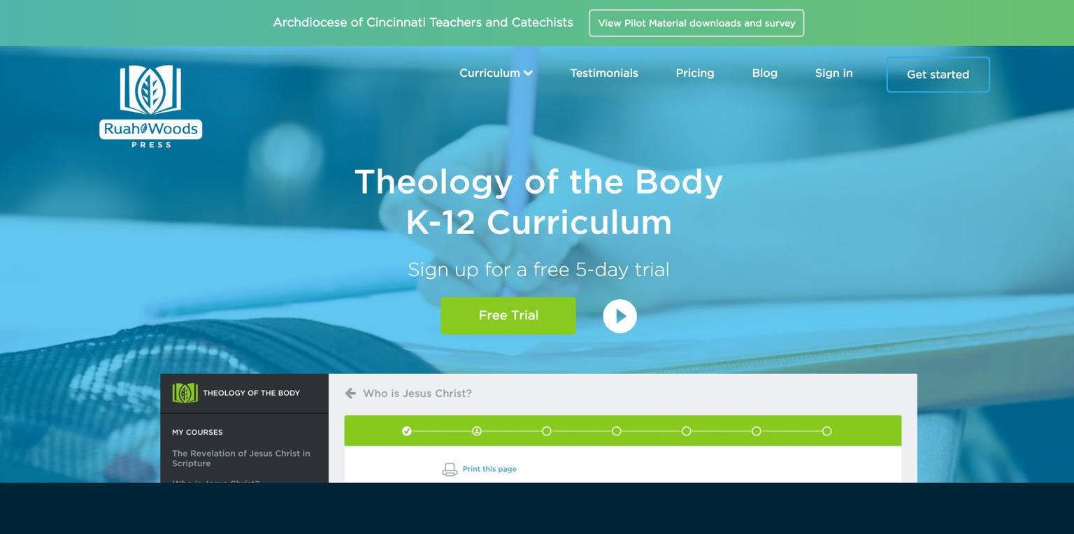
Since a perfect website needs to cater to all customers, you should have both primary and secondary CTA. Ruah Woods Press has a primary CTA to sign up for a free trial and a secondary CTA to watch a video for more information.
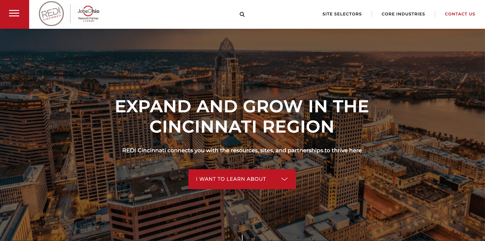
As another example, REDI Cincinnati, uses “Contact Us” as the primary CTA, and “I want to learn about…” with a drop-down of options as the secondary CTA. This secondary call-to-action is very clear and allows the user to freely explore the services and information REDI provides, without feeling the pressure to get in touch immediately.
2. Purposefully place the calls to action
Now that you have decided what types of CTAs to use in your web design, you need to consider placement. Timing matters when it comes to popping that important question.
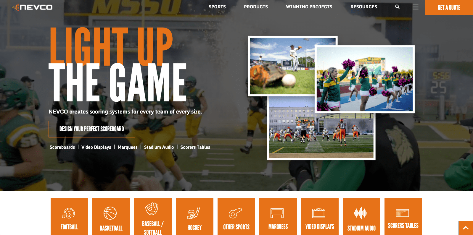
Generally speaking, a good rule of thumb is to include the primary CTA in the upper right-hand corner of your web design. The eye is drawn there, and people expect to find it there. Make it stand out by using a colorful button and don’t clutter that area of the website. For instance, on Nevco’s website, the eye is naturally drawn to the bright orange primary CTA, “Get a Quote” in the right-hand corner. The secondary CTA, “Design Your Perfect Scoreboard,” is also easy to identify in the hero.
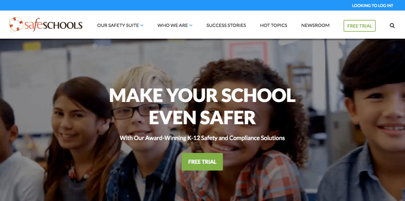
Safeschools.com uses “Free Trial” as the primary CTA, as seen in the upper right-hand corner as well as on the hero section of the website below the headline.
Sprinkle secondary CTAs throughout your website depending on the potential paths you’re asking your visitors to take. These can be on the homepage and throughout the interior pages of the site. If you’ve included the primary CTA in the top right corner of the navigation, users have an easy path to click once they’ve learned more about your brand and are ready to take the plunge.
3. Use appropriate language to entice website visitors to click
You have the types and placements figured out, but do your visitors understand what you’re asking them to do? Be sure to consider the language you are using in your web design CTAs. They should be simple, clear, and easy to understand. If your CTA is too wordy or filled with too many complex terms, your users won’t click.
At the same time, it’s a balancing act between clear and boring. A primary CTA button like “try for free” is clear and enticing, especially because of the word “free.” On the flip side, something like “sign up for our newsletter” is clear but also boring. Most visitors aren’t likely to sign up for a standard newsletter. Instead, use language related to the content of your email updates to entice users to subscribe. “Get tips now” or “Keep me posted” may work better for collecting email addresses. Copy near the button is important for giving context. You have more space here to sell visitors on the benefits of taking you up on your CTA.
Bottom line - be clear and creative, but not so creative that visitors don’t know what you’re saying and offering. Ruf Briquetting Systems uses “schedule a free press test” as the primary CTA. Using the word “expert” draws the user in and adds authority and credibility.

4. Keep the conversation rolling
Now that you’ve nailed web design CTA – the type, placement, and language, you hopefully have visitors hooked. If they’ve taken you up on that primary CTA, congratulations! But what about those users who weren’t quite ready to “marry you” yet? Here comes the hard part. How do you keep them interested after the initial touchpoint and secondary CTAs?
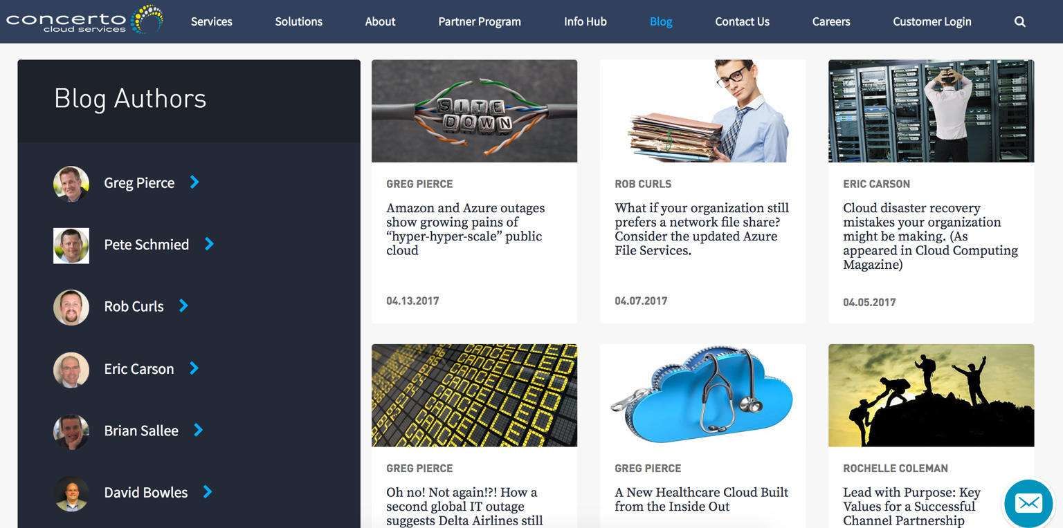
Keep prospects engaged by sending out email updates and posting content on the channels your users are visiting, whether that’s blogs, Facebook, or LinkedIn. Make sure that your content is relevant, authentic, and speaks to the user appropriately depending on where they are in the buyer journey. For instance, Concerto Cloud Services has a long sales cycle, so they keep potential buyers engaged by making frequent updates to the blog on their website.
You’ll often direct users back to your website, so be sure that this content also always includes primary and/or secondary CTAs.
Time to start asking your user to take action! To wrap everything up, tune into this brief video:
Still unsure how to convince your audience to click on that CTA? Book a meeting and let’s talk.
US Digital Partners
Content Strategy Team