10 Best Practices for Nonprofit Websites
A nonprofit website is incredibly important since it acts as the face of an organization and provides viewers a place to learn about the mission and goals of the organization.
Posted: Apr 23, 2021
Last Updated: Jun 11, 2024

A nonprofit website is essential since it acts as the face of an organization and provides viewers with a place to learn about the mission and goals of the organization. Nonprofit sites must be clear in their core messages and vision to attract and inform potential donors and volunteers.
Non-profit websites share many of the same best practices as other sites, but they have some specific needs beyond what a corporate website provides users. Whether creating a website for the first time or beginning a redesign, some nonprofit website best practices are important to keep in mind. Keep reading to learn about these 10 best practices.
Nonprofit Website Best Practices
1: Clearly communicate the value of your organization and explain what the organization does
Nonprofits work against a unique challenge: they have multiple target audiences, and their messaging must speak to all (donors, volunteers, news and media outlets, etc.). Regarding communication, nonprofits must tailor their messaging to answer each audience’s questions and needs. Don’t take for granted that your site visitors already know who your organization is or what you do. Instead, remember to clearly communicate the purpose and value of your organization to help attract volunteers and encourage online donations.
Before people are willing to donate and support a cause or organization, they need to know the type of work the organization does and how it operates. Your audience wants to know your organization’s mission, goals, objectives, and work, as well as how it uses donations and contributions. Make sure to share with your website visitors what you do and how you do it as clearly and succinctly as possible! Your site’s homepage should always answer the user’s question, “What are you trying to achieve, and how will you spend my money?”
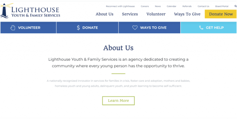
Lighthouse Youth and Family Services prominently display who they are and what their organization does on their website homepage.
2: Prioritize an easy-to-find, easy-to-use donation process
Many nonprofit websites will have a primary call to action for donations. The wording in your call-to-action buttons should prompt action from the user. For example, use clear wording like “Donate” or something more actionable like “Donate Now.” Try to avoid unclear terms or terms that may lead users to believe you are talking about time donations, such as “Contribute.”
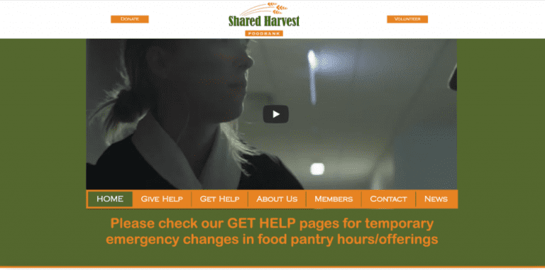
Bad Example: Shared Harvest’s website includes a “Donate” button, but it gets lost on the page due to its small size and visual similarity to the navigation buttons and “Volunteer” CTA.

Good Example: The Franciscan Missions website provides users with a clear, actionable, and easy-to-find CTA of “Please Donate” both on the page and consistently across the site in the navigation bar.
It’s best to make the donation process easily accessible from anywhere on your website and keep a consistent “Donate” button within reach from all site pages. One way to accomplish this is to add a large, prominent CTA button into a “sticky” navigation bar that remains at the top of the screen as users scroll down your site, in addition to repeating the donate call-to-action in the main body content of each webpage of your site.
Always having an easy route to donating may seem repetitive, but when users are mentally and emotionally ready to donate, you don’t want them to struggle and look all over the site for how to help your business. If there’s too much friction or confusion, users (who may be potential donors) will leave your site.
3: Make it easy for volunteers to find information or apply/sign up
While the main call to action on your site may be for donations, don’t discount the importance and prevalence of people who are passionate about what your organization does and want to help (but who might not be in a position right now to donate monetarily). Ensure that you make it easy for them to find information about how they can get involved – whether that’s steps they can take on your site, an application to print and fill out, or just multiple contact methods for them to contact you.
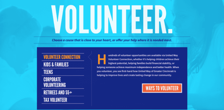
United Way of Greater Cincinnati includes a detailed section on their homepage of multiple ways volunteers can get involved, with a clear CTA of “Ways to Volunteer” that takes users to a page with more information. They also include multiple ways of contacting them, as well as a designated email address for people interested in volunteering.
4: Use visual storytelling and impactful photos
Emotionally charged photos of those you serve, images of real people volunteering and making a difference, and infographics with solid and informative data will make your mission more visual to your audience. Pictures and videos can often convey messages and emotions more powerfully than mere words. Consider investing in videography to add to your site, whether that’s a simple video loop for your site’s homepage, an explainer video of what you do and who you serve, or a series of video testimonials from the people you serve or your volunteers.

The homepage of the St. Anthony Shrine website includes a full-page video loop that helps tell the story of the Shrine and the friars who call it home.
Did you know we’ve got video production services? Creating impactful videos can be a challenge. Let us help.
5: Simple is best
When it comes to websites, especially for non-profits, it’s always good to remember the KISS principle from the U.S. Navy: Keep it simple, stupid. Practically, this means you should keep your website design and content simple, clean, minimal, and use plenty of white space. A common misstep many non-profit websites make is adding every single piece of information right on the homepage. Instead of taking this approach, make it easy for users to find what they need quickly, but don’t overwhelm them with ALL the options. The simpler the site design and the more minimal the content, the better the most critical information and design elements will stand out for users to find easily.
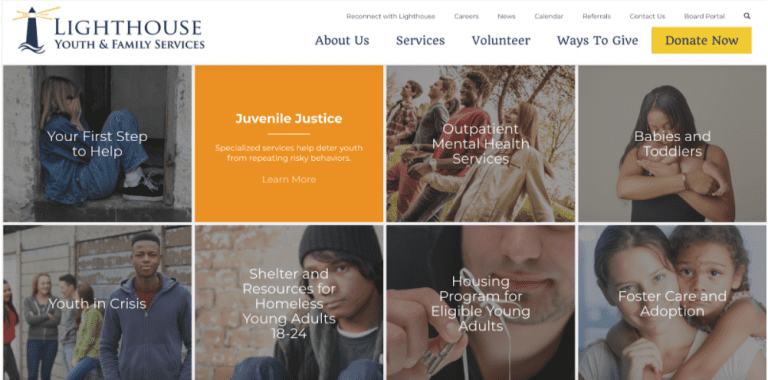
The homepage of Lighthouse Youth and Family Services includes a section of their services and programs in a simple way with engaging imagery. On hover, users can find out a little more about the program, but to see even more information they are prompted to click Learn More and go to that program’s specific page. This prevents the homepage from becoming too cluttered with ALL the information about every single program or service.
6: Make your site media-friendly
Help the media help you. News coverage and media attention can bring more awareness and donations to your organization, so make it easy for that portion of your users to find what they need. Ensure you provide organizational information, images, quotes, a press kit, and contact details for key personnel.
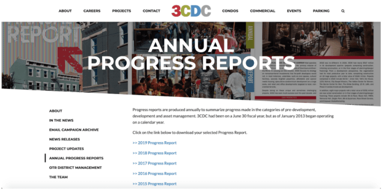
3CDC includes multiple sub-pages in their About section with information that would be helpful to stakeholders and media, such as news releases, project updates, annual progress reports, and team members.
7: Approach your site from a content-first perspective
One of the best practices for a nonprofit website is to have a content-first perspective, meaning you must focus on the content before any design or “cool-factor” aspects. Here at USDP, we like to say that the content should inform the design and design should support the content. This means that the design of your nonprofit site should revolve around relevant, helpful content (copy, imagery, videos, etc.). Doing so helps ensure that the users on your site (who may be future donors or volunteers) can easily find what they’re looking for.
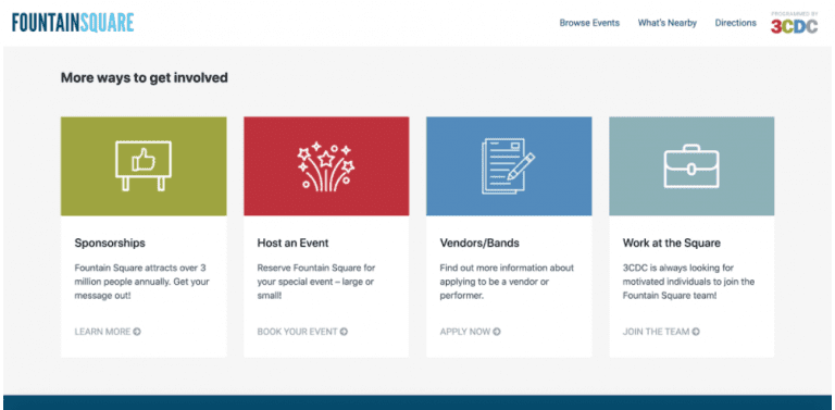
Fountain Square has relevant, helpful, user-focused content throughout the site to help all audience types find what they’re looking for easily.
We get it. Writing great content can be really hard. Over the years, we’ve mastered the art of writing effective, customer-centric content that results in more audience engagement and conversions. Learn more.
8: Include a blog or news section
Another nonprofit website best practice is to consider adding a section designated to news or a blog. A news section is a great way for users to learn more about your nonprofit’s mission, and a news section allows them to stay up to date on the latest news. Bonus tip: not only is a blog post or news section a way to add more content, but it also can help improve your site’s SEO and Google search rankings by having relevant industry keywords in the content.

Acumen, a non-profit organization that tackles poverty, includes a blog on their site to showcase their newest initiatives and highlights any mention in outside news sources.
9: Be honest and ethical
If you decide to include an option for recurring donations, this can actually influence users to check that option and bring in more revenue for your organization. However, make sure not to auto-check boxes and “sneak in” recurring donations. Tricking users hurts businesses long-term, so take the honest and ethical route and let your users choose whether to opt-in or not. When users land on the charity water donation page, the “Give Once” option is already selected. They must manually select a monthly recurring amount.
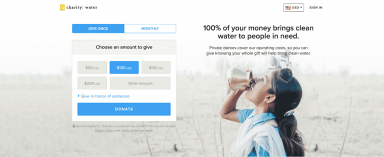
When users land on the charity:water donation page, the option to “Give Once” is already selected. Users must manually select a monthly recurring amount themselves.
10: Make it easy for people to engage with your organization
Aim to have an integrated, cohesive digital marketing and communications strategy. Try to have consistent branding, active social media, and monthly or quarterly email updates. Employing these practices builds trust and brand awareness and will encourage more participation from your audience. Allow users to engage with you how and when they want to and cater to their different preferences by including various media outlets that will enable you to reach more visitors through their preferred channels.
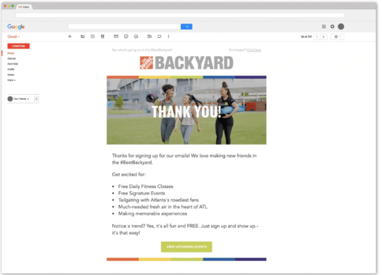
The Home Depot Backyard employs their fun branding across all aspects of their marketing channels, from print to web to social media to email marketing.
Apply these nonprofit website best practices today
As you keep these nonprofit website best practices in mind and get started creating a new site or giving your existing one a facelift, make sure your whole team aligns with the vision and purpose of the site. Make a list of the goals for the site before starting the design process and writing content. Is the site primarily to allow existing members to stay updated? Is it to solicit donations? Is it to get new volunteers or members? Is it to raise awareness in general? Discussing these goals prior to spending time, money, and resources on updates will save a lot of headaches down the road.
Next Steps
Digital marketing agencies like us can help with implementing these best practices onto your website so the communication to your audience is as clear as possible. Just reach out to get started.
Maybe you already have a great website, but you’re wondering why visitors won’t convert into customers. We’d recommend reading our blog post on How to Design Landing Pages That Convert to get a jump start.

US Digital Partners
Content Strategy Team